Color in landscape
Color is one of the most rewarding elements of the landscape, but also the one that represents perhaps the greatest challenge when it comes to working on its intervention.
Since vision is the first sense that we use to obtain a perception of space, the appropriate use of color is essential, since it affects the observer’s state of mind, as well as the understanding of the place where he is. Color is present in each and every one of the elements of a landscape, contributing, on the one hand, to give it a particular character, and on the other, to establish the chromatic synthesis of a landscape image (what is known as “ambient color”).
In addition to contributing to the composition of the landscape image, color also determines part of its character and identity. Colors are known to affect our emotions and have psychological effects on our minds. We generally associate warm colors with strong emotions (for example, red as a sign of danger or orange with joy), while cool colors such as blue and green induce feelings of peace and relaxation. When looking at them, warm colors (red, orange, yellow) tend to draw our attention more to the landscape, while cool colors (blue, green and purple), being more neutral and undefined, can create a homogeneous landscape that give a sense of unity and depth to space.
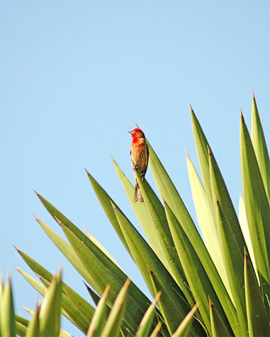
Municipality of Santiago de Anaya, where nature stands out in color, shapes and textures
Photography: Lizette Fernanda Romero Moncada
Theory of color
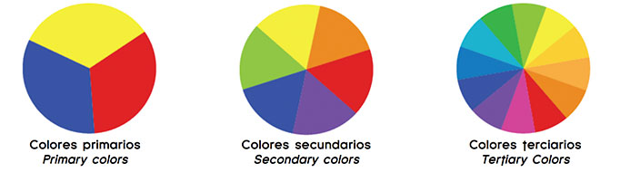
Color has a basic and instinctive visual appeal. As color theory expert Faber Birren once said, “Color is the only experience in life that does not require a conscious struggle of the intellect to be appreciated”. The theory of color is extremely complex, but the essential thing is that color is a property of light, as was proved by Isaac Newton in the 17th century, and that, in very general terms, there are 3 basic colors (red, blue and yellow) from the mixture of which secondary colors (green, purple and orange) and tertiary colors are derived. This wheel of color can be divided into warm and cool colors, and color theory states that colors are harmonics combined in certain ways.
Color schemes
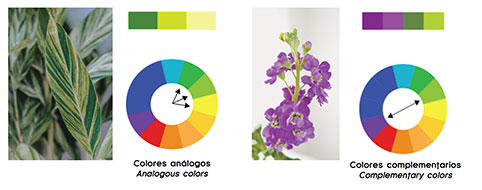
Based on the above, the following schemes can help us to choose the appropriate color combination: Monochromatic colors: a single color is applied, but using different intensities or tones. An example would be to match red with several roses and with a deep red or garnet. Complementary colors: they are the opposite colors on the wheel and create a harmonious set when placed together. They are powerful and very vibrant combinations in the garden. Some examples would be combining red with green, orange with blue, and yellow with purple. Analogous colors: they are those three colors that are together on the color wheel, and therefore harmonize. For example, red-violet is next to violet, or blue is next to blue-green.
With the large number of annuals and perennials available, these combinations are easy to achieve. Tertiary colors: consists of the choice of three colors that are equidistant on the chromatic circle, creating concordance when used together. For example, yellow with red and blue, orange with green and purple, etc.
Design principles with color
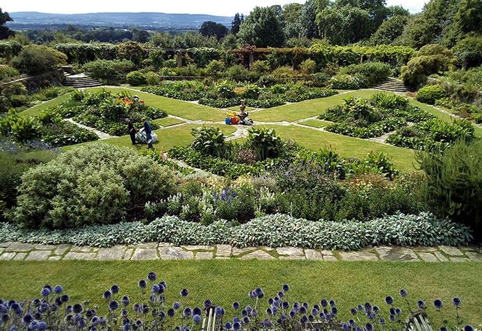
The basic principles of color design that can help us plan and design a landscape are: Unit. It gives coherence to a design. It implies an agreement between the chosen elements. Unity can be achieved by choosing plants with similar characteristics as the basis for the design (for example, plants with the same size, color and type of leaf, plants of similar appearance, etc.). Focal points. They are the opposite of unity; they are points of emphasis that contrast and are different from the rest of the other plants. They serve to focus attention to a certain place, and can be architectural, such as a sculpture or fountain, or natural, such as a plant with an unusual color or shape. Balance. It is an even distribution of visual weight. In formal design, we place on one side a characteristic element exactly the same as the one on the other side to achieve balance. The design of a garden can also be balanced asymmetrically by compensating for visual weight using different plants or colors from one side, allowing the eyes to rest.
Rhythm. It is a movement formed through recurring elements, which can be achieved in landscaping by repeating plants of a certain color at regular intervals. The English Garden designer and forerunner of landscaping, Gertrude Jekyll, developed, since the 19th century, theories of color that are still used today, and that she applied in her designs of gardens and esplanades using perennial plants. In them, she combined the colors while also thinking about the life cycle of the plants themselves to keep the concept intact. Color can be used in landscaping to achieve the following effects: • Create a certain mood. • Accentuate important areas that you want to highlight (such as a front door, a path, etc.). • Unify the overall design. • Complement the colors of other plants. • Attract fauna, such as birds, butterflies, etc. • Balancing the designs of a garden or esplanade. • Adapt an outdoor space to the general landscape.
Hestercombe house y gardens
Photography: Ripplestone review, via Flickr (CC BY-ND 2.0)
Harmony of color
The color combinations can have a harmonious effect, or be a set of contrasting tones that generates changes in our mood when traveling or perceiving a landscape. Harmony can be defined as a pleasant arrangement of elements, be it when it comes to music, poetry, color, clothes, or even food. In visual experiences, harmony is something that pleases the eye. It attracts the viewer and creates an internal sense of order, a balance in the visual experience. When something is not harmonious, it is boring or chaotic and is generally rejected by the mind of the observer. A viewing experience can be so bland that the viewer does not engage with it (as the brain will reject unstimulating information), or so overloaded and chaotic that it will be difficult to look at it. The human brain rejects what it cannot organize, what it cannot understand. The visual task requires the presentation of a logical structure that can be achieved through the harmony of colors, which provide visual interest and give a sense of order to the landscape. This dynamic balance that is sought in color design is often determined by context. Environmental influences, the color schemes that predominate, whether in a natural environment or in the neighborhood of a city, as well as other characteristics of the site, play a very important role in choosing the color or colors to be used when intervening in a landscape. The colors of arid landscapes vary considerably from cool green landscapes or from the distinctly regional colors of the architecture of individual cities. Be aware of all the colors of hard landscape materials: such as pavement, site furniture, fences, garages, and other items. Color is also an individual choice that reflects the personality and desires of the landscaper. Nature is a perfect starting point to create and define the harmony of color in the landscape.
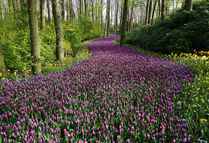
Path with purple flowers
Photography: Pixabay – Pexels
While the perennial plants maintain their characteristic tones, the bushes, flowers, trees and other elements of the vegetation change their costumes with each season, creating different scenarios to be observed. Its backdrop (the sky and the elements on which they stand out, such as mountains, rocks, seas, forests, beaches, valleys, etc.), is also transformed to give each view its own identity and unity. In the case of natural landscapes, generally, the predominant colors are: green in spring, light green and yellow in summer, red and orange in autumn, and white in winter. Thus, the landscape constitutes in itself the canvas where nature functions as the color palette that painters and artists use to choose those tones that achieve highlight, harmonize, contrast, balance and give unity and meaning to a certain view, that generally it is conditioned by the climatic and geographical characteristics of that space. As mentioned above, the sense of sight is the one that has the greatest influence on perception, and we can affirm that, in general, human beings identify and associate certain landscapes with certain colors by default (for example, blue with the sea, ocher with desert regions, yellow with beaches, green with wooded areas, white with snowy environments, etc.). However, at a particular level, each of these environments has individual elements that stand out, contrast or are adapted to those landscapes, such as cacti in the desert, palm trees on the beaches, flowering plants in the forests, etc.
In conclusion, the choice of colors to design a landscape works in exactly the same way that we choose the clothes that we are going to wear, the tones that we select to paint the walls of our house, or the hues that we choose to decorate a store or a restaurant: seeking to generate a certain effect and atmosphere and giving it its own identity. Thus, we can affirm that the correct handling of color both in the treatment of natural landscapes and in urban landscapes, is essential to achieve a space appropriate to their own vocation and destiny, where the viewer who contemplates and experiences it can feel attracted and at the same time gratified by being there. It should not be forgotten that in each aspect of the design the personality and intention of the landscaper is reflected, who has nature itself as the best teacher in order to maintain visual and spatial harmony, giving order and balance to the spaces. Go ahead and put these tips into practice and try combinations that you had not imagined. The result will surprise you!

Landscape at sunrise
Photography: Walter Otto


-10.28.24.jpg "Anunciate07-13-a-la(s)-10.28.24")

 13.26.42.png "Captura de Pantalla 2023-02-08 a la(s) 13.26.42")